01
Order creates confidence.
Make assets easy to find, names easy to understand and next steps clear. Precision is our strongest trust signal.

Brand identity / Version 1.0
A quiet, dependable identity for the place where other brands come together.
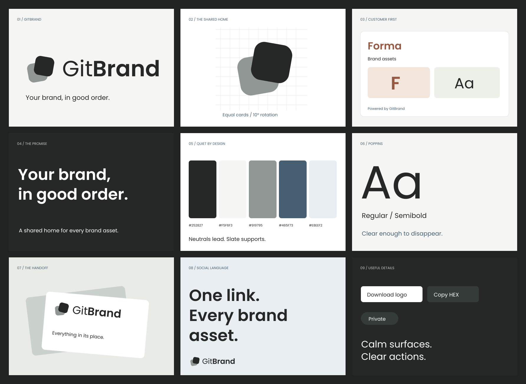
01 / Foundation
GitBrand brings logos, colors, fonts and brand guidance into one organized, shareable place. Its identity should make the product feel dependable while giving every customer's brand room to lead.
01
Make assets easy to find, names easy to understand and next steps clear. Precision is our strongest trust signal.
02
Neutral surfaces support colorful identities. GitBrand is the useful host, not the visual center of every customer page.
03
Use specific actions and honest feedback. Describe what the product does without inflated promises or invented proof.
For teams sharing a company's identity, GitBrand brings brand assets and guidance into one organized, shareable home.
Primary audience: brand, marketing and design teams. Secondary: agencies. Recipients: partners, developers, press and collaborators. Inferred from the product; not a customer-research finding.
02 / The identity
The overlapping cards retain the character of your reference. Equal proportions, a gentler tilt and a calmer contrast between “Git” and “Brand” make the system more balanced.


Built to scale



The dedicated micro symbol removes rotation at tiny sizes. Use the full master everywhere else.
Two 62 × 62 units. Radius 16. Paired 10° rotations. Foreground upper right, rear lower left. A shared home for distinct assets.
Keep the supplied proportions, colors and spacing. Do not stretch, add shadows, rotate the whole lockup or recolor it with a customer's palette. Outlined letterforms make the logo portable.
03 / Color
Off-white and charcoal carry the identity. Slate adds a measured functional accent. Colorful customer assets stay visually distinct from the platform around them.
Select a swatch to copy its HEX value.
Aim for 85–90% neutral surfaces, 8–12% text and structure, and at most 3–5% accent in marketing compositions. This is a design guide, not a pixel quota.
Stone is for the mark and decoration, not body text. Use #606A65 for secondary copy. Keep functional controls accessible regardless of the customer's palette.
The supplied verification report records calculated contrast pairs. Light text uses Ink, Muted or Slate on White/Paper. Dark mode uses #F5F6F3 text, #B4BDB7 secondary text and #B7C9D6 links on #1C201E or #252B27. A #7A847E control border remains distinct in both themes. Status colors are paired with text labels. Decorative #DCE0DD rules do not stand in for control boundaries.
04 / Typography
Poppins keeps continuity with the current product. Regular and Semibold are enough to create a complete hierarchy without unnecessary variety.
ABCDEFGHIJKLMNOPQRSTUVWXYZ
abcdefghijklmnopqrstuvwxyz
0123456789
Poppins Regular 400 / Semibold 600
Included SIL Open Font License · Font source
| Role | Desktop | Mobile |
|---|---|---|
| Display / 600 | 64 / 70 | 40 / 46 |
| Page / 600 | 40 / 48 | 32 / 40 |
| Section / 600 | 28 / 36 | 24 / 32 |
| Card / 600 | 20 / 28 | 20 / 28 |
| Body / 400 | 16 / 26 | 16 / 26 |
| Label / 600 | 14 / 20 | 14 / 20 |
| Caption / 400 | 12 / 18 | 12 / 18 |
Values are size / line height in px. Use sentence case, normal body tracking and no more than −0.03em tracking for large headings.
05 / Visual language
Softened corners make the system approachable. Precise spacing makes it feel reliable. The card overlap belongs in storytelling; working interfaces stay aligned.
Spacing
A 4 px base, an 8 px rhythm. Larger intervals: 48, 64 and 96. A 1200 px maximum marketing container with 24 px gutters.
Shape
8 px controls, 12 px cards, 20 px feature panels. Use 1 px rules and sparing shadows. Reserve pills for statuses.
Motion
Short transitions that explain state. No continuous floating or scroll-dependent reading. Respect reduced motion.
06 / Product application
GitBrand owns the useful frame. The customer owns the content and visual emphasis. Shared repositories should feel like a home for that brand.
Fictional customer / Identity application
Materials for a considered world.
Illustrative layout, not a shipped screen. Forma is fictional. The theme switch demonstrates proposed tokens; customer artwork is never automatically inverted.
GitBrand's fullest expression. Editorial type, a small accent and occasional dark panels.
Neutral navigation and clear controls. Recognizable customer identities inside repository cards.
Customer logo first. One quiet attribution. GitBrand's logo should be optically smaller than the customer's.
07 / Voice
Use specific verbs, useful explanations and accurate feedback. Sound like a considerate colleague who knows where everything belongs.
“Add your first logo.”
“HEX copied.”
“Choose who can access this brand.”
Describe one action. Use sentence case. Give the next step.
“Revolutionize brand synergy.”
“Perfectly secure. Always.”
“Your AI will never go off-brand.”
Do not claim approval, security or consistency beyond the product's actual behavior.
09 / The brand world
Uncoated stock, soft daylight and simple layers extend the identity into physical applications. Use product imagery and real brand assets before decorative photography.
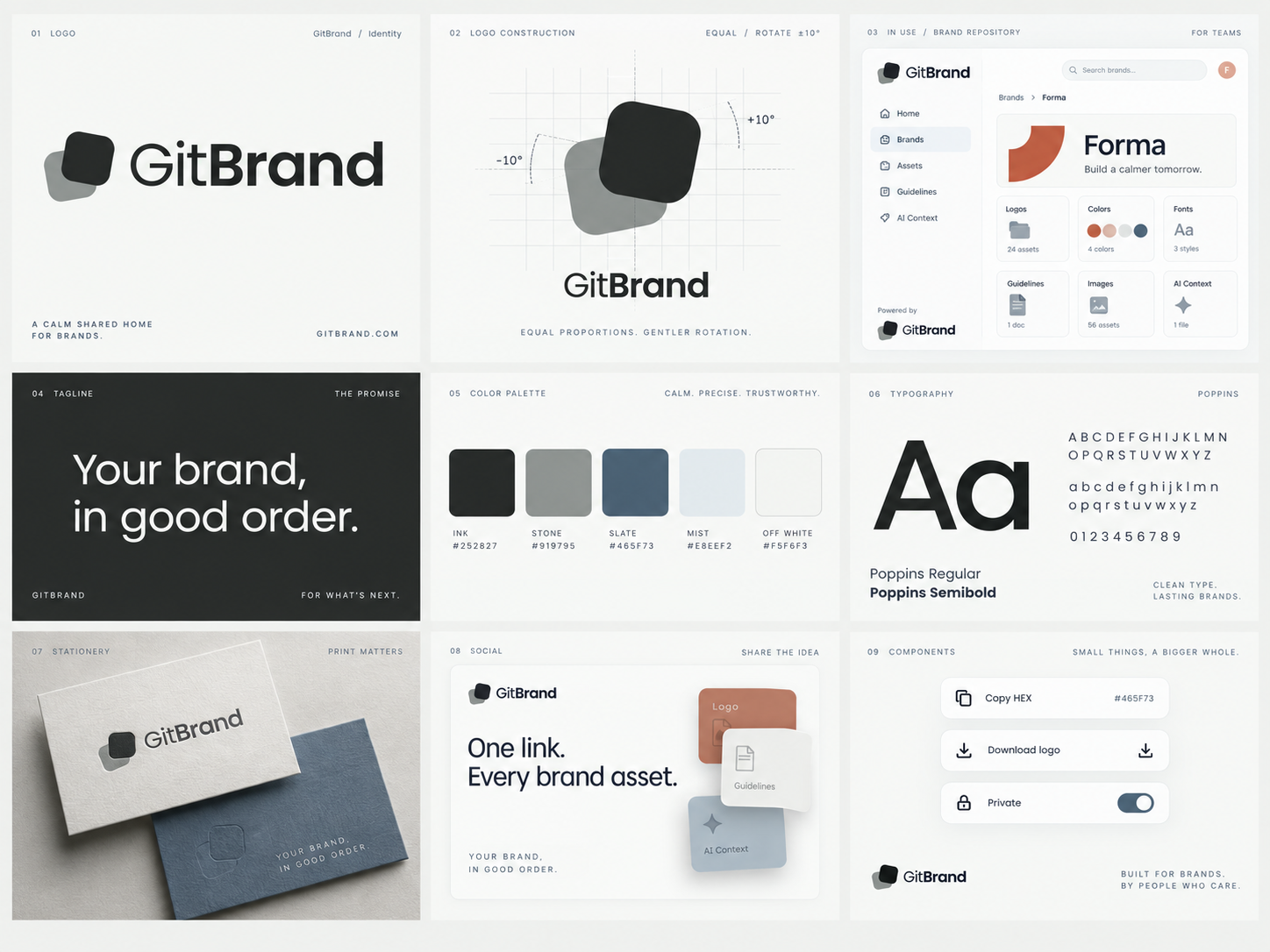
Generated art-direction study. Use the vector masters for exact logo geometry and the written guidelines for approved wording; generated sample details are illustrative.
10 / Handoff
Production vectors, PNG exports, fonts, sample posts, source generators and implementation tokens. The same identity is used throughout the application.
Suggested rollout: logo and favicons → shared tokens → header and footer → customer repository attribution → forms and feedback → marketing. Check long customer names, both themes and keyboard access before shipping.
08 / Social system
Useful ideas.
A recognizable rhythm.
One message per image, generous margins and the same quiet card language. The caption adds the detail. Ready-to-edit captions and alternative text are included.
The next time someone asks for your logo, send your brand.
GitBrand brings logos, colors, fonts and brand guidance together in one shareable home. Your team and collaborators can find the materials they need without another round of messages.
Read all captions and alt text ↗Five-slide educational carousel / 1080 × 1350 each. Samples are drafts; nothing has been published.